Monday, December 13, 2010

Final Pieces.

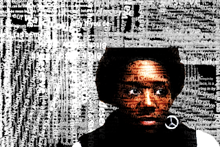
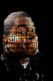
ART 262- These are my final pieces for this class. I think I learned a lot. I definitely wouldn't have been able to do this before I took this class. I know that you could just look up a tutorial for this, but the fact that I was actually comfortable with the program says a lot. I am now comfortable with the keyboard shortcuts and I know how to use most of the adjustments in photoshop. I feel really good about my pieces. I know we were suppose to incorporate our actual major and I did just that. The photos in my pieces were taken by me. I just put a little spin on them. I'm proud of them. I hope everyone likes them and can see that I worked really hard on them.

PROCESS:
First I started with my image that I was going to use. I desaturated it then saved it as a PSD so that I could use it for displacement. Then I open a blank document. I filled it with black. Then, I used the horizontal text tool and just started typing different things. I would change the size of the font and I would change up whether it was bold, italic, or regular. Once I got enough text that I was happy with, I added a layer style to each of the text layers. I put a drop shadow on each with a 90 degree angle. After that, I put all the text layers into one group then merged the group. Then I copied the group and put a slight Gaussian Blur on it, then merged the two group layers. After that, I went to filters>distort>displace and used the file I created at the beginning. After that was done, I brought in the color file and then I went to Layer > Layer Style > Blending Options and chose linear burn which brought to the front the text. That's the basics. I brought in a another copy of the color file and overlaid it on top and that made the image brighter and brought out the text better. You can also de saturated the image a little to give it some better tones. I did this with each image but I gave each final piece a little uniqueness. Like I said before, I like how these turned out and I am very proud of them.


Huntsville Vs. Houston

ART 236- For our third assignment, we went to the streets of Huntsville and Houston and just shot what we saw and such. It was fun. I definitely like Huntsville better but just because I knew it better.

Houston-


Huntsville-


Nancy Game

ART 262-


Pencil Vs Camera!

ART 262- Mine is not nearly, NEARLY as good as this guy----> http://www.flickr.com/photos/benheine/sets/72157623723956821

BUT I like how it turned out. Pretty cool.

Color

ART 236- This was a hard assignment. I just didn't feel like I really understood the assignment. But I had fun.

Illustrator Tools

ART 262-
The Eraser tool (Shift-E) erases any area of the object over which you drag.
The Perspective Grid allows creating and rendering artwork in perspective.
The Blend tool (W) creates a series of objects blended between the color and shape of multiple objects.

Photoshop Tools


ART 262- This is for our final.

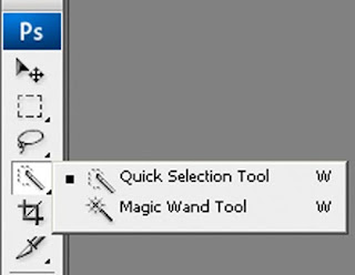
Tool One (w)- The Quick Selection tool: It lets you quickly “paint” a selection using an adjustable round brush tip.
HOW TO USE IT: 1. Select the Quick
Selection tool 2. In the options bar, click one of the selection options: New, Add To, or Subtract From. New is the default option if nothing is selected. After making the initial selection, the option changes automatically to Add to.

3. To change the brush tip size, click the Brush pop-up menu in the options bar, and type in a pixel size or drag the slider. Use the Size pop‑up menu options to make the brush tip size sensitive to pen pressure or a stylus wheel. When creating a selection, press the right bracket (]) to increase the Quick Selection tool brush tip size; press the left bracket ([) to decrease the brush tip size.

4. Choose Quick Selection options. Sample All Layers Creates a selection based on all layers instead of just the currently selected layer.
Au

to-Enhance Reduces roughness and blockiness in the selection boundary. Auto-Enhance automatically flows the selection further toward image edges and applies some of the edge refinement you can apply manually in the Refine Edge dialog with the Contrast and Radius options.

5. Paint inside the part of the image you want to select. The selection grows as you paint. If updating is slow, continue to drag to allow time to complete work on the selection. As you paint near the edges of a shape, the selection area extends to follow the contours of the shape edge.

If you stop dragging and then click or drag in a nearby area, the selection will grow to include the new area.

To subtract from a selection, click the Subtract from option in the options bar, then drag over the existing selection.

To temporarily switch between add and subtract modes, hold down the Alt (Windows) or Option (Mac) key.

To change the tool cursor, choose Edit > Preferences > Cursors > Painting Cursors (Windows) or Photoshop > Preferences > Cursors > Painting Cursors (Mac OS). Normal Brush Tip displays the standard Quick Selection cursor with a plus or minus sign to show the selection mode.
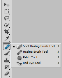


Tool Two(J)- Spot Healing Brush Tool: removes blemishes and objects
HOW TO USE IT: The Spot Healing Brush tool quickly removes blemishes and other imperfections in your photos. The Spot Healing Brush works similarly to the Healing Brush: it paints with sampled pixels from an image or pattern and matches the texture, lighting, transparency, and shading of the sampled pixels to the pixels being healed. Unlike the Healing Brush, the Spot Healing Brush doesn’t require you to specify a sample spot. The Spot Healing Brush automatically samples from around the retouched area.

Formal Elements

ART 236- This assignment was all about how you see and what you see in things around your everyday life. I enjoyed this one a lot. Not only was it fun to go out and look around and to notice things I have never really seen, but we got to shoot in black and white which was nice. These are just a few of them. The first is emphasis, the 2nd is shape, and the 3rd is space.

Friday, December 10, 2010

Motionless wheel.

ART 236- This is the first post that is for my concepts class with Becky. I loved this class so much. I learned so much about my photography and how I see things and how to approach things within the frame of my camera. I learned a lot. I like to try a lot of different things for my assignments because I don't know exactly what my style is yet. I haven't found my voice but after taking this class I know I will find it by the time I finish my last 3 semesters.


This is photos from the first assignment. It had to do with motion.


Thursday, December 2, 2010

People Mauplation


ART 262- This one wasn't hard at all. Anyone with basic knowledge of photoshop can do this. It was actually fun but I got a lot of strange looks in the computer lab.

Anticipation

ART-262


I didn't like this one.


And it shows.

Impossible Landscape.


ART 262- I don't think I fully understood this one, but I actually kinda like it. It's different. It's impossible and it's a landscape....

Floral Grunge


ART 262- This was the last piece we had to do in Illustrator. I enjoyed it. It was fairly easy. I like how it turned out.

Change of Pace

ART 232- This class is in the darkroom. Me and the darkroom have a love/hate relationship. I have always wanted to learn how to devolpe my own film. After taking this class, I now know how but I thought I was going to like it more. I like knowing how to do it but I think my mind is more into digital form. My ideas are better shown through ditgital format rather than analog. While I apperciate the art form, I don't think I could just work like that. Which brings me to photograms. At first, I hated them. HATE. People can make really really good ones, but not me. After months of working with them, these are my best ones.


This one is just done with light.


This one is a little differnt. I exposed it to light from the enlarger for about 5 seconds then put it in a 4 by 5 pinhole camera and exposed for about 30 secs outside. I like the result.

Music and Lyrics


ART 262-Music is a big part of my life. So when this project was assigned, I knew I was gonna like it. This is the website that we were told to look at---->http://www.musicphilosophy.co.uk/


Very cool. This is my final project. The lyrics are from I Am Not a Robot by Marina and the Diamonds. I got it for free on itunes on day. I didn't like it at first but it grew on me. :)


Link to a live preformence of this song----> http://www.youtube.com/watch?v=9FfgrH1v710


Drawing on the Computer


ART 262- One day in class, we were asked to draw our neighbor with the mouse. It was really different. I can't draw. Not even a little bit. But I was kind of excited for this. It was wasn't as hard as I thought it was. I don't think my drawing looks like my neighbor BUT it does look like a person and that is what I was shooting for...

Simple celeb poster and Movie poster

ART 262- For the simple celeb poster, our example for this came from this artist----> http://www.geekiz.com/simple-public-figures-by-ali-jabbar

It was a really cool idea but I was having trouble executing it. This was my final product.


I thought it was funny, but I think I could have done a little better.


For the movie poster, we got our example for this guy----->http://www.geekiz.com/movies-posters-minimaliste-par-pedro-vidotto


This one I could do and I think I did it well. Here's my final piece.


Celebrity with border

ART 262- The next project was to take any celebrity put them in a different background and give them or the whole picture a border that fit that celebrity. Again, I was a little discouraged. Finally, I just dived right in and this is what it came out to be. I tried my best.

3D....BLAH.


ART 262- Our 2nd big project was to create an image with shapes and colors that looked 3D. I had a lot of trouble with this. It seemed pretty easy but I just couldn't grasp the concept. A lot of people in my class had beautiful work but mine was missing something. This was my final product.

The Color Wheel.


In ART 262, the first project we had to do in Illustrator was to make a color wheel. It was too diffcult but I had no experience with Illustrator before this class. This was my final product.


It's been a while.

So as the semester comes to a close, I am going to start posting some of my work from my classes. I didn't always enjoy these projects, (most of them I did) but I can say with complete confidence that I did learn a lot from my teachers.

So enjoy. Or not. Whatever.

Tuesday, April 6, 2010

Final TEXTURES!!


I really liked our texture project. It was a lot of fun when I finally decided what my colors were and when I got together all the tools I was gonna use to make my textures. I really don't like to paint but I feel like this was different. My colors were orange, purple, and green.


Self.


Ok. This project....THIS PROJECT!!! I just could not THINK of what I wanted to do. I just didn't understand the project and I couldn't get into it. So...I just sat down and thought about myself and what are my best qualities. I had to figure out what was important to me and what I wanted people to know. Well, I googled friendship because I know I am a good friend. If people had to descibe me in one word, I hope it would be loyal. I found this symbol online. It is an African symbol for loyal. I thought that this was perfect. For the second part of my protects, I put "barbed wire" around it because I am a protector. I really don't know what I was doing. It has meaning to me but if you don't know me well then I fee like the person viewing it wouldn't quite understand the meaning behind it.